Atomic
Relaunch
For the relaunch of Atomics website I worked on the overall user experience and information archtecture and prototyped some visions and concepts ranging from navigation concepts up to innovative showcasing of products.
Deliver what's expected
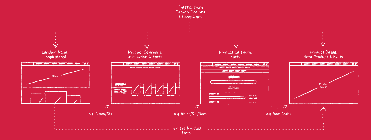
From the landing page to the detail of a product, users should follow a intuitive red line that provides the expected depth of information and the right serving of inspiration. While the landing page picks up visitors and leads them into different direction, the disappearing of inspiration and the increase of information and facts around products comes along with the progress of the users journey towards a product page.
Show what’s relevant
Implementing an easy way to switch between categories and the ability to limit the number of products using an additive filtering system was inevitable in order to enable users to access the huge product range of Atomic with ease. To save up space for the presentation of products, the common e-commerce filter sidebar was transformed into a horizontal sticky navigation and the ability to switch categories instantly was added. This vision was tested with a simple mockup and prototype.
Product Detail Experience
While fresh ground was already broken with the rethinking of common e-commerce UI components like sidebars and filters, matters were brought to the head when designing the exploration of a product in detail. Telling a story and adding little big details and subtle but impressive interactions should make the real difference to other competitors in the industry. One of the most complex but most fun to work with was the product line of skis which offered a lot of potential to execute a wide range of new ideas.
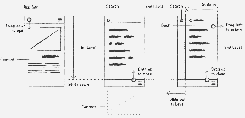
Prototyping a two level menu approach for mobile
After setting up the initial information architecture it was obvious that we had to deal with a pretty bold navigation structure in order to cover all the different product segments and categories. While the design of a navigation for desktop devices went pretty straight forward, we faced the challenge to come up with a good working concept for the mobile version of it. To put ideas to a test I prototyped a version that clearly separates the second level from the first level while making the search functionality available on both.