Portfolio
Melanie Daveid
In early 2015 I collaborated with the very talented UX Designer and Art Director Melanie Daveid to craft her new portfolio website. We quickly agreed that her online portfolio should be a combination of simplicity, blocking colors, beautiful interactions and the integration of Melanie’s lettering artworks.
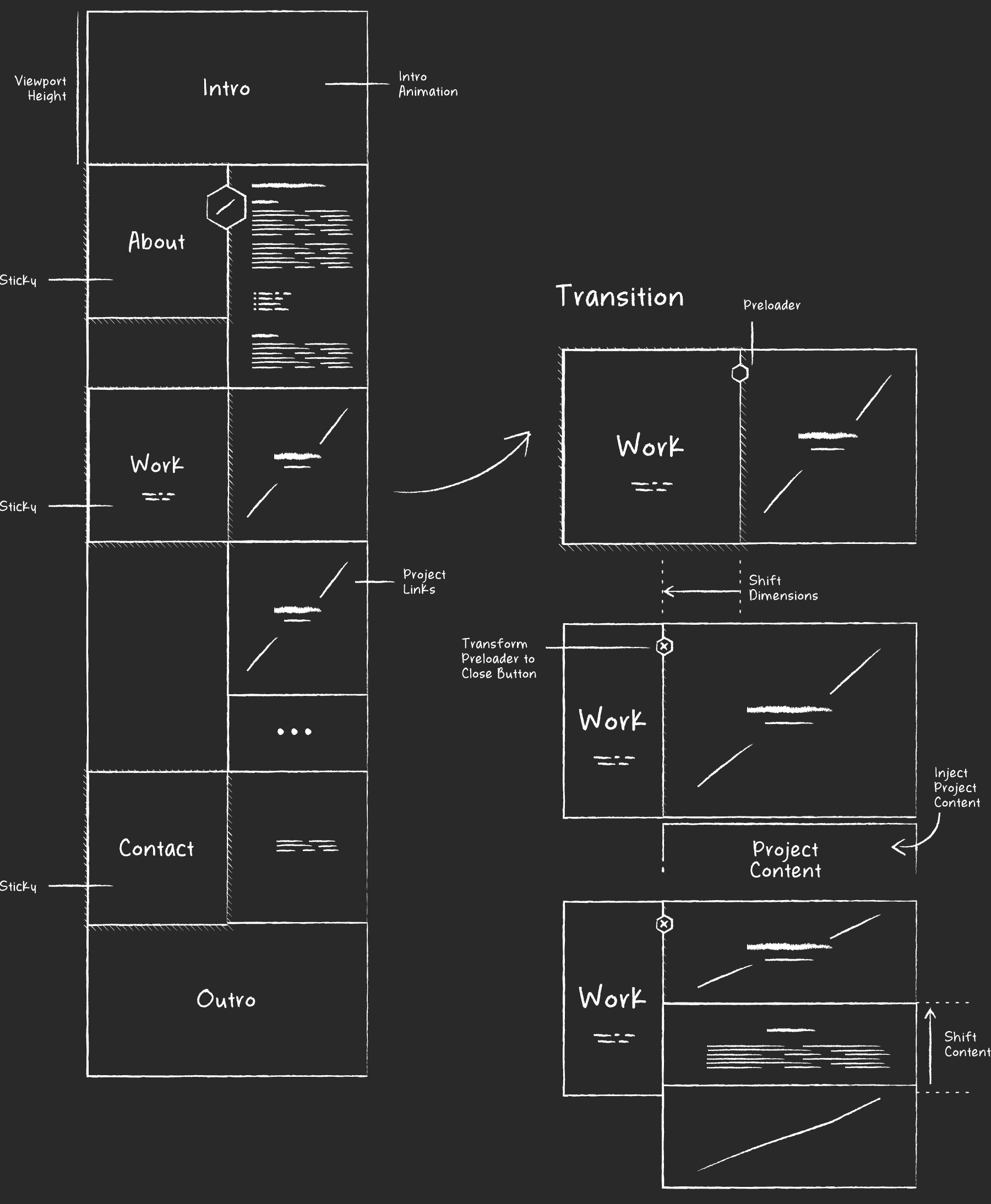
One-page layout with a seamless case study integration
Melanie’s idea to serve a one-page layout with a seamless integration of her work faced us with the challenge to preserve access to other projects while viewing a project case study in detail. After sketching different ideas and prototyping the most feasible ones we finally came up with an approach to inject project case studies without loosing the red line and preserve the overall simplicity of the site. We spend a lot of time finding the best workflow and transitions to switch the interface from a list of projects to the view of a single case study and vice versa.

From head to toe – Accessible on all devices
Serving the site on all devices was achieved by using an early version of the open-source framework Row Low. You can compare both versions and scroll through the different sections of the site.

SVG Animation Madness
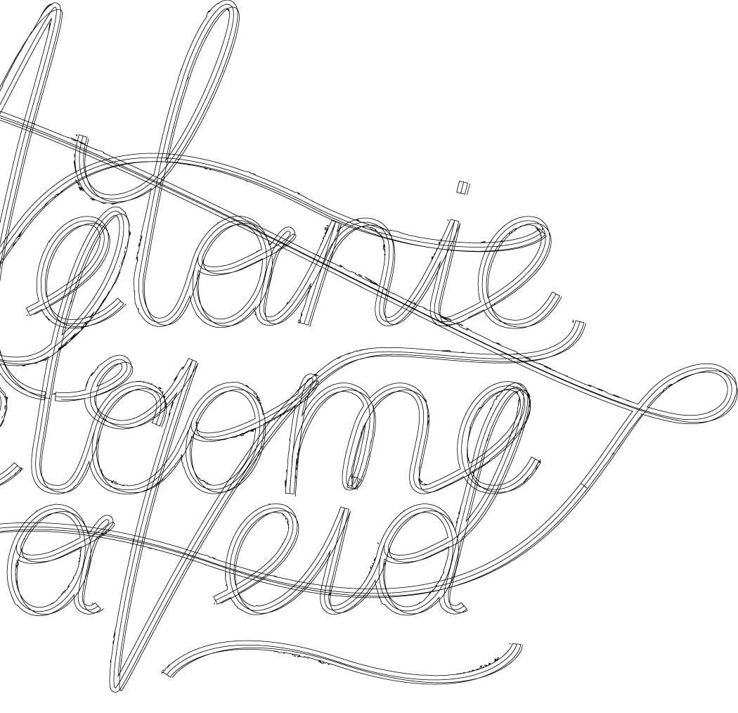
Our vision of the website included the usage of Melanies lettering artwork for headlines. We had the idea of animating these headlines and after researching for various possibilities I decided to use SVGs to maintain the overall scaleability of the site and serve high quality animations with just a few kilobytes in size. There seems to be a pretty thin line to success or totally fail by the complexity and sensibility of the SVGs data structure that needs to be created by hand in order to turn the lettering artwork into performant animations. We choose an agile approach to settle the requirements for the file structure and anatomy of the SVGs. While I turned the letters into suitable SVGs first and then applied animations, Melanie fine tuned the compositions.
While we both have been coming across some great line animations on websites already, we were pretty stoked by the outcome of our very first rough version. Fine-tuning the timing and overall transition durations took plenty of time but from that point on we knew that every bit we are adding will be totally worth it.

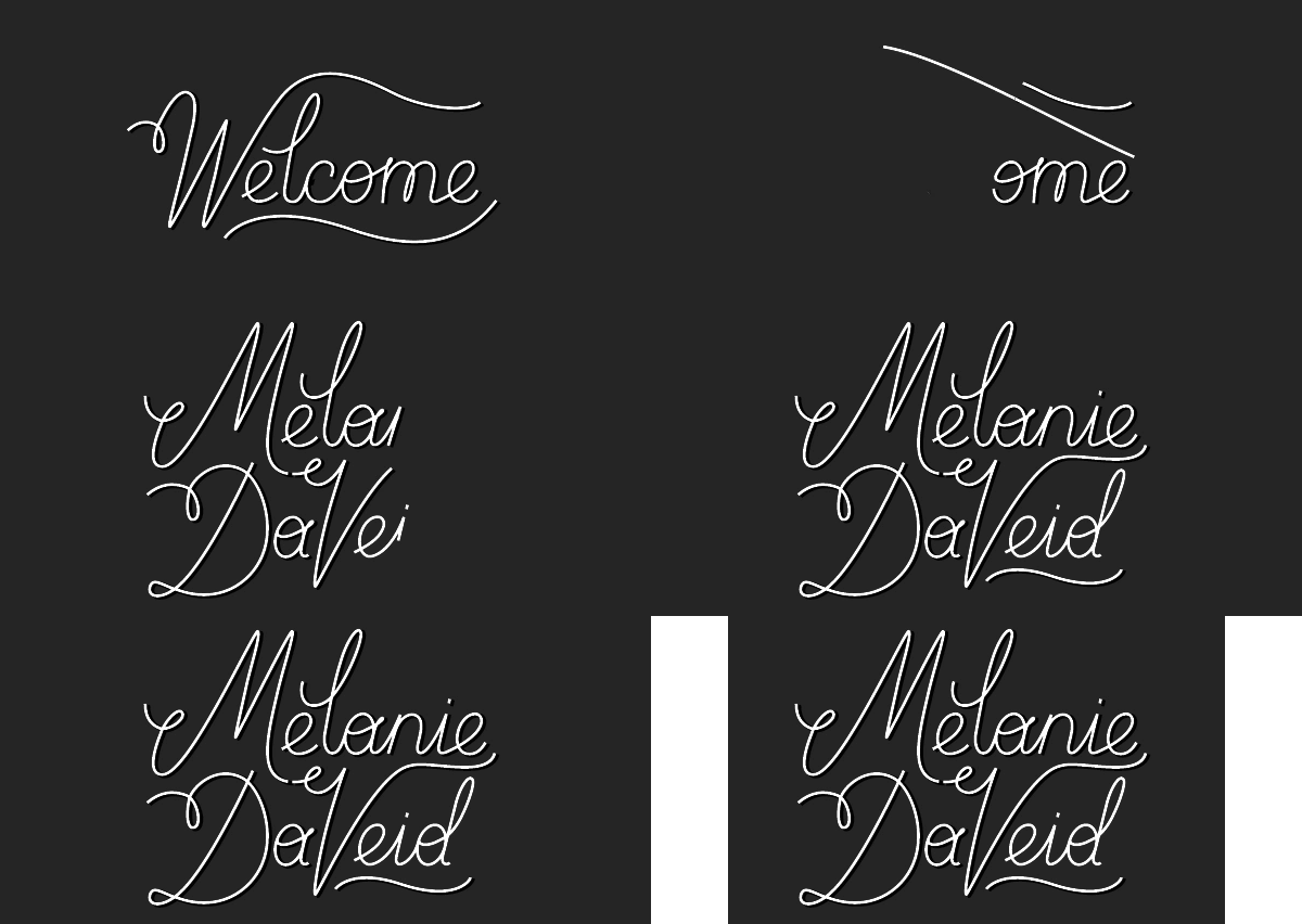
Welcome
Now a beautiful little animation welcomes visitors to Melanies website. Especially the creation of the seamless transition between Welcome and Melanie Daveid was one of the little details we had to figure out with a bit of trial and error.

Role
UX Design, Development
Awards
Awwwards – Site of the Day
Client
Melanie Daveid
